From research to visual identity
Glow Genie began with research into contemporary skincare and beauty brands, exploring how colour, imagery and digital culture shape perceptions of wellness and beauty. Two initial moodboard directions were developed before combining soft neutrals, muted greens and warm pinks into a visual system designed to feel both clean and youthful.
The identity was then translated into a flexible logo system, colour palette and typography direction that could move consistently between packaging, social media and digital touchpoints.
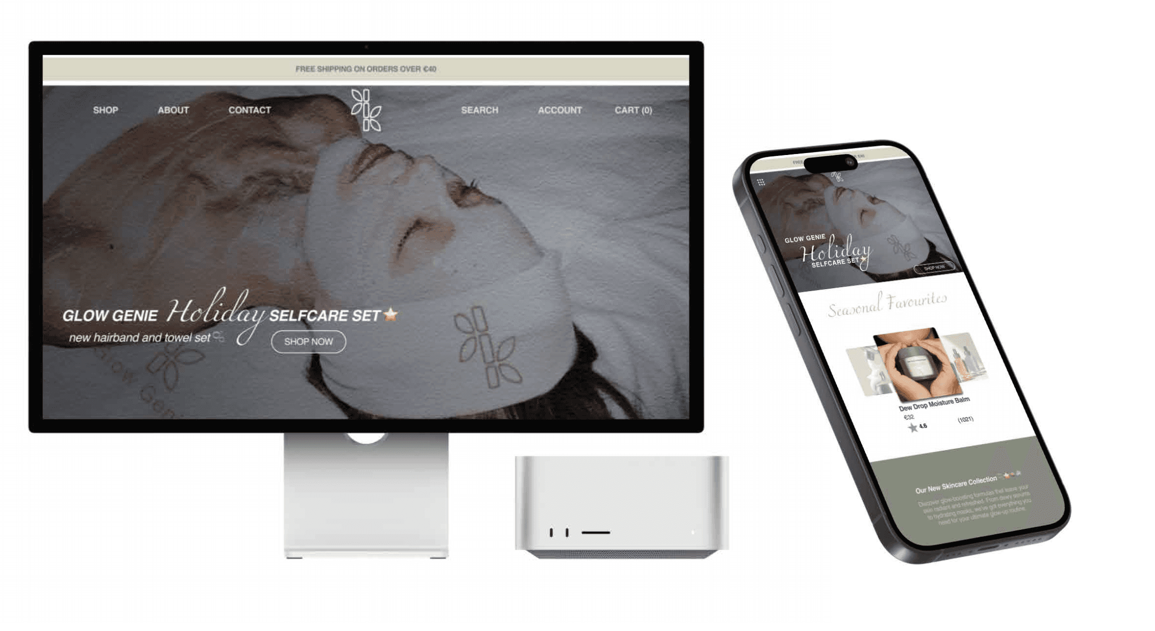
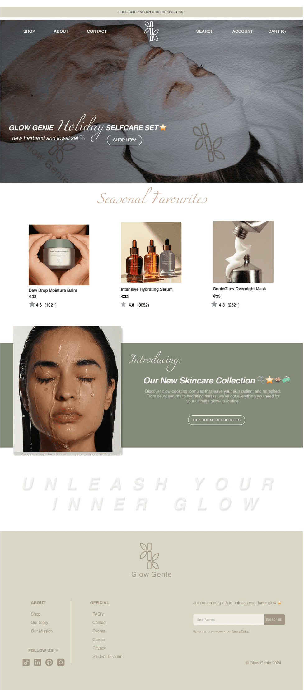
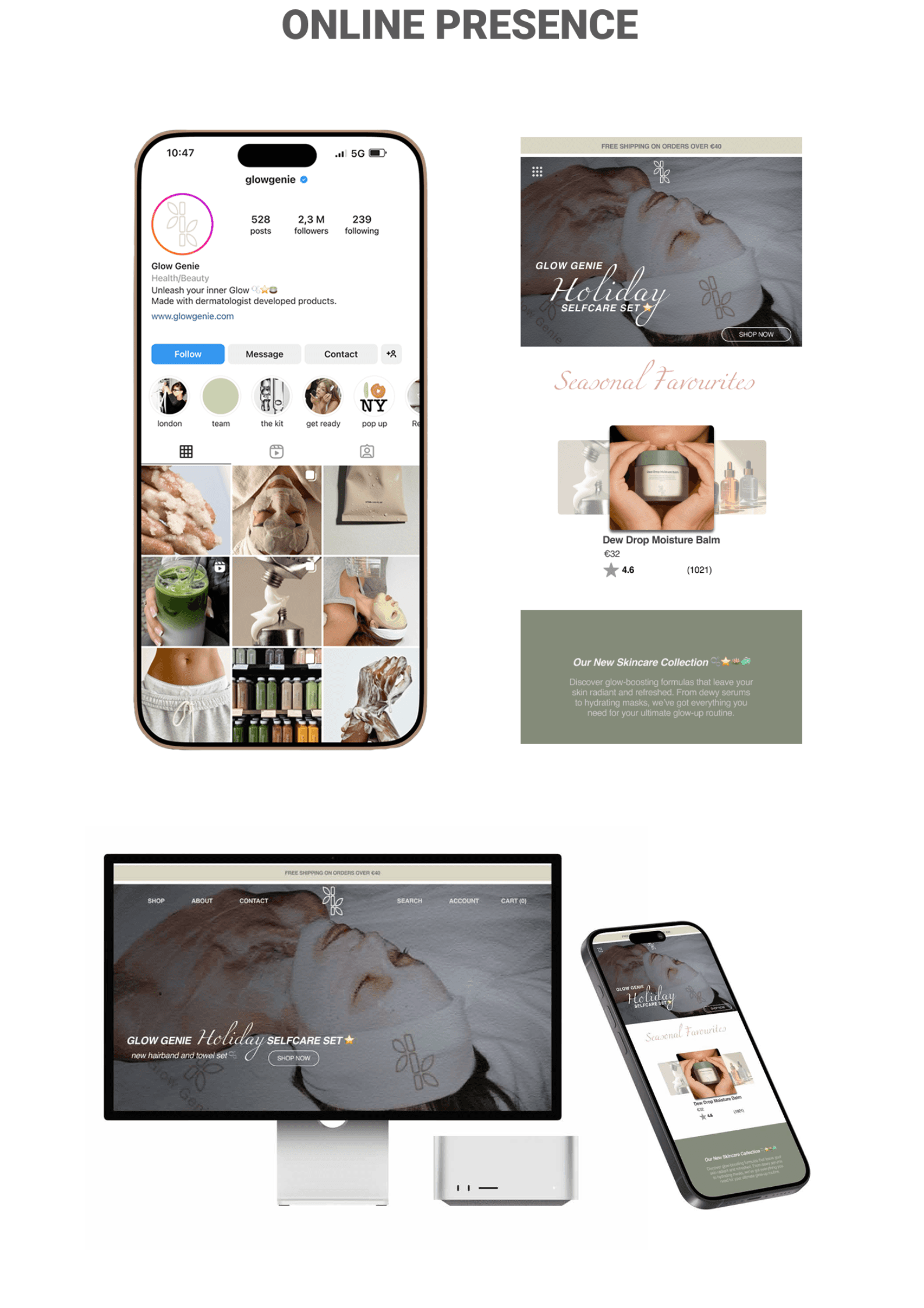
Translating the brand across screen
The visual identity was extended into a digital experience spanning social media and a responsive e-commerce concept. The Instagram direction was designed to feel natural and moodboard-led, while the desktop and mobile website explored how Glow Genie's softer visual language could support product discovery and skincare storytelling.